Vendor design language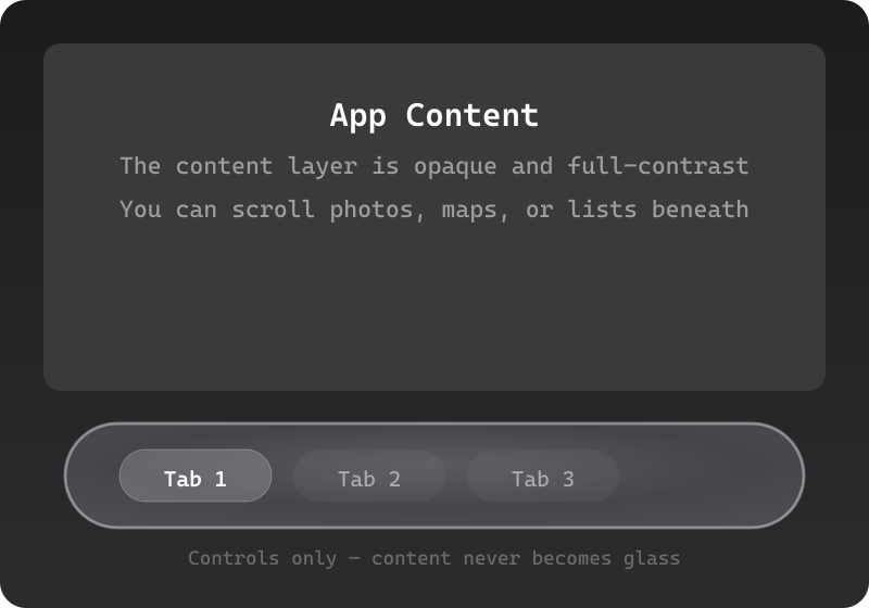
Liquid Glass
Apple's own name for the adaptive material introduced across iOS 26 / macOS Tahoe (WWDC 2025). A vendor-defined design language, documented in Apple's Technology Overviews and HIG.
Defining Signals
- Glass = the control layer — only controls and navigation are glass; the content beneath stays opaque and full-contrast
- Lensing, not just blur — the material behaves like a real lens, bending and concentrating light with bright edge highlights
- Adaptive self-tinting — the glass continuously re-tints from the content scrolling under it to stay legible
- Capsule and concentric geometry — controls tend to capsules with nested corners sharing a common center
Overview
What makes this style what it is.
Liquid Glass is Apple's adaptive material for controls and navigation: toolbars, tab bars, buttons, and sliders render as lens-like glass that floats in its own layer above app content, refracting what scrolls beneath and re-tinting itself for legibility in light and dark contexts. It is functional, not decorative — Apple applies it to the control layer and keeps content itself opaque. Capsule shapes and concentric corner radii are part of the geometry.
Style brief — paste into your agent
Build the UI using Liquid Glass (Apple's adaptive material). Only controls and navigation are glass — toolbars, tab bars, buttons, sliders, and nav bars render as lens-like translucent material. The content beneath stays opaque and full-contrast. The glass behaves like a real lens: it bends and concentrates light with bright edge highlights, and continuously re-tints itself from the content scrolling underneath to stay legible. Controls tend toward capsule shapes with nested concentric corner radii.

CSS starting points:
- Glass control layer: background: rgba(255, 255, 255, 0.08); backdrop-filter: blur(40px) saturate(200%) brightness(1.1); -webkit-backdrop-filter: blur(40px) saturate(200%) brightness(1.1); border: 1px solid rgba(255, 255, 255, 0.2); border-radius: 980px; /* capsule */
- Adaptive tint: use CSS color-mix() or JS to shift the glass tint based on the dominant color beneath it
- Edge highlight: box-shadow: inset 0 1px 0 rgba(255, 255, 255, 0.35), 0 2px 12px rgba(0, 0, 0, 0.12);
- Content layer: fully opaque, high-contrast text, no blur

Do not drift into glassmorphism: the glass is reserved for the control layer only — content cards and text stay opaque. Do not drift into Aqua: Liquid Glass is adaptive and lens-like, not candy-gel with specular highlights. Preserve 4.5:1 text contrast, ensure the glass re-tints for legibility in both light and dark contexts, and provide visible focus rings on controls.
Origin
Introduced by Apple at WWDC 2025 as the first unified design language across iPhone, iPad, Mac, Watch, and TV — Apple credits visionOS's glass optics as the inspiration, and ships it as a system material with SwiftUI/UIKit/AppKit APIs.
Often Confused With
This is Liquid Glass because the glass is a functional system material reserved for controls and navigation floating above opaque content, adapting its own tint for legibility. It would become glassmorphism if the frosted treatment spread to the content itself — translucent cards over a decorative wallpaper, blur as a skin rather than a control layer.
Related Styles
Explore connected design movements.