Home
Design Styles
A taxonomy of design movements and visual languages — sourced, analyzed, and referenced for pattern-aware UI decisions.
Style Directory
Each entry captures defining signals, origin context, and relationships between movements.
Established movement
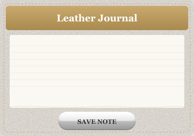
Skeuomorphism
- Simulated real materials — surfaces look made of something physical (leather, paper, linen, brushed metal) with visible texture or grain
- Physical lighting model — gloss highlights, bevels, and inner shadows imply a light source: buttons bulge outward, fields sink inward
- Real-object metaphors — the UI is drawn as the object it replaces: a notepad with ruled paper, a bookshelf of covers, a dial you rotate
View details
Industry-coined trend
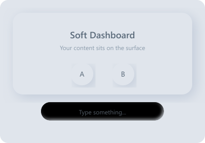
Neumorphism
- One continuous surface — controls and background share the same matte color; elements aren't placed on the page, they're molded from it
- Dual soft shadows — every raised element carries two blurred shadows: a light one up-left and a dark one down-right
- Pressed (inset) states — inputs and active states invert the shadow pair inward so the element looks pressed into the surface
View details
Industry-coined trend
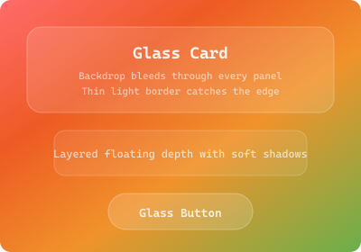
Glassmorphism
- Frosted translucent panels — surfaces are semi-transparent with a strong background blur, like frosted glass
- Vivid backdrop showing through — a colorful gradient, photo, or aurora sits behind the glass; its color bleeds through every panel
- Thin light edge — a 1px semi-transparent white border catches the rim of each panel, separating glass from glass
View details
Vendor design language
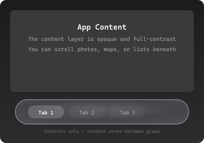
Liquid Glass
- Glass = the control layer — only controls and navigation are glass; the content beneath stays opaque and full-contrast
- Lensing, not just blur — the material behaves like a real lens, bending and concentrating light with bright edge highlights
- Adaptive self-tinting — the glass continuously re-tints from the content scrolling under it to stay legible
View details
Contested label
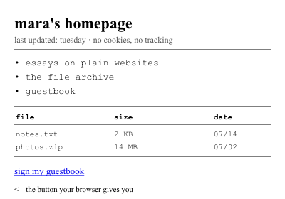
Web Brutalism
- Browser-default materials — Times/system serif or monospace, default-blue underlined links, visited-purple; the stack looks unstyled even when deliberate
- Exposed document structure — headings, lists, tables, and <hr> dividers in source order; structure is the layout
- Zero decorative rendering — no shadows, gradients, rounded corners, or imitation materials; at most 1px solid borders
View details
Industry-coined trend
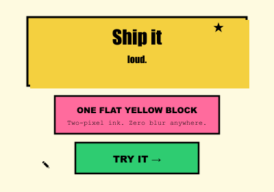
Neobrutalism
- Thick black outlines — every element wears a uniform 2-3px solid black border, like an inked comic panel
- Hard offset shadows — shadows are solid black shapes displaced down-right with zero blur; graphic depth, not simulated lighting
- Saturated flat color blocks — unapologetic fills in yellow, hot pink, lime, cyan laid flat on a cream or white ground
View details
Retrospective label
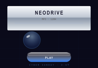
Y2K Digital Aesthetic
- Liquid chrome and metal — mirror-finish chrome, brushed steel, and silver gradients; type and frames rendered as if machined and polished
- Gel and glossy plastic — translucent candy-like buttons with strong specular highlights; the 'you want to lick it' gloss
- Iridescent blue-silver palette — electric blue, silver, white, and holographic cyan-magenta shifts; cool synthetic color
View details
Retrospective label
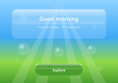
Frutiger Aero
- Nature fused with tech — skies, water, grass, leaves, fish, and bubbles as the ambient world the UI floats in; ecology as a tech promise
- Glossy glass and aqua surfaces — translucent panels with strong curved specular highlights; wet, light-filled gloss rather than matte frost
- Sky-blue / grass-green palette — luminous cyan-blues and fresh greens with white light; bright, clean, and warm-lit
View details
Established movement
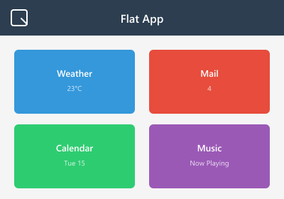
Flat Design
- Solid 2D color fills — every surface is one flat color; no gradients, gloss, texture, or material of any kind
- No simulated depth — no drop shadows, bevels, or highlights; elements sit on one plane, edges drawn by color change alone
- Simple glyph icons — icons are reduced to minimal geometric silhouettes; a single-color shape reads as the whole object
View details
Established movement
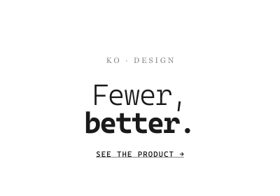
Minimalism
- Negative space as material — emptiness is deliberate and generous; the space around a thing is what makes it matter
- Restricted element count — few things on screen, and every one earns its place: one nav, one message, one action
- Limited or monochrome palette — one or two hues at most, often just black/white/grey with a single accent
View details
Industry-coined trend
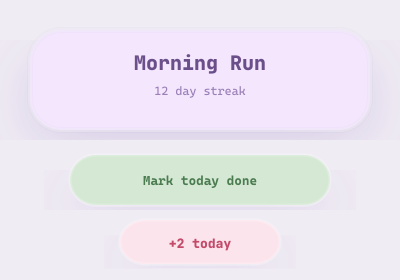
Claymorphism
- Two inner shadows + one outer — a light inner shadow on top, a darker inner shadow at bottom, and a soft drop shadow below; the surface reads as inflated
- Oversized corner radii — corners are dramatically round (radii around a third of the element's height); every shape reads as a soft blob
- Independently colored, floating objects — each element has its own fill distinct from the background and visibly floats above it
View details
Retrospective label
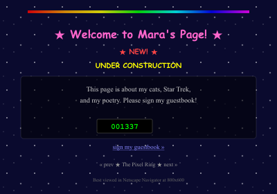
Vernacular Web
- Tiled background texture — a small image repeated edge to edge (starry night sky, clouds, marble) as wallpaper
- Animated GIF ornaments — twinkling sparkles, spinning @ signs, flaming rules, striped UNDER CONSTRUCTION signs
- Collected badges and counters — visitor counter, guestbook links, webring prev/next buttons, 'best viewed in Netscape' badges
View details
Vendor design language
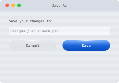
Aqua
- Candy-gel controls — buttons look like translucent gel drops with a bright specular highlight across the top and an inner glow beneath
- Pinstriped surfaces — window backgrounds and title bars carry fine alternating light stripes; the signature Aqua wallpaper
- Gumdrop window controls — close/minimize/zoom as glossy red, yellow, and green candy spheres in the title bar's top-left corner
View details
Vendor design language
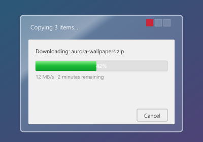
Windows Aero
- Transparent blurred window frames — title bars and window borders are real translucent glass; wallpaper blurs through them while content stays opaque
- Specular sweeps and reflections — diagonal light streaks cross the glass and controls as if polished; reflection is part of the material
- Glowing hot controls — controls light up under the cursor: close button floods red, min/max glow blue, buttons gain a luminous halo
View details