Contested label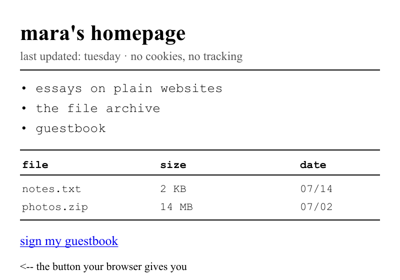
Web Brutalism
Named by analogy to architecture's béton brut ('raw concrete'). Practitioners disagree about scope: the strict reading is 'raw browser materials, honest structure'; the loose reading lumps in any deliberately ugly site.
Defining Signals
- Browser-default materials — Times/system serif or monospace, default-blue underlined links, visited-purple; the stack looks unstyled even when deliberate
- Exposed document structure — headings, lists, tables, and <hr> dividers in source order; structure is the layout
- Zero decorative rendering — no shadows, gradients, rounded corners, or imitation materials; at most 1px solid borders
- Utility-first density — information is packed tight and loads instantly; the aesthetic argument is speed and honesty
Overview
What makes this style what it is.
Web Brutalism treats the browser's own materials as the finished surface: default or system fonts, unstyled-looking links, visible document structure, plain borders and horizontal rules, and density over polish. Nothing pretends to be anything else — no gradients imitating glass, no shadows imitating depth. At its best it's honest and fast (Craigslist, Hacker News, early-web personal sites); at its worst the label gets stretched over anything unpolished.
Style brief — paste into your agent
Build the UI using Web Brutalism. Use the browser's own default materials as the finished surface: system serif or monospace fonts, default-blue underlined links (visited = purple), unstyled-looking form controls. Expose the document structure directly — headings, lists, tables, and <hr> dividers in source order; structure IS the layout. Zero decorative rendering: no shadows, no gradients, no rounded corners, no imitation materials. At most 1px solid borders. Information is packed tight and loads instantly.

CSS starting points:
- Reset nothing: use browser defaults for font-family, link colors (#00e blue, visited purple), and form controls
- Layout: plain block flow, max-width: 65ch for readability; <hr> for section dividers
- Borders: 1px solid #ccc at most; no border-radius, no box-shadow, no background gradients
- Type: font-family: system-ui, serif; — let the browser choose
- Links: underlined, default blue; :visited default purple

Do not drift into Neobrutalism: this is genuinely raw browser defaults, not a styled look pretending to be raw. No thick black borders, no hard offset shadows, no saturated color blocks — those are Neobrutalism's designed costume. Do not drift into Minimalism: the density is high and the aesthetic is honesty/speed, not art-directed negative space. Preserve text readability with adequate line-height and max-width for body text.
Origin
Named by analogy to architecture's béton brut ('raw concrete'); the web usage spread in the mid-2010s through Pascal Deville's brutalistwebsites.com and essays like Smashing Magazine's 'split personality of brutalist web development', as a reaction against the sameness of polished startup sites.
Often Confused With
This is Web Brutalism because the page is genuinely built from browser defaults — system type, blue links, bare structure, no decorative rendering at all. It would become Neobrutalism if the rawness were styled: saturated color blocks, thick uniform black borders, hard offset shadows, and chunky display type — a designed graphic language, not defaults.
Related Styles
Explore connected design movements.