Established movement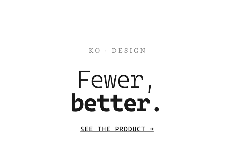
Minimalism
Borrowed from the mid-century art and architecture movement; NN/g's 112-site study pinned down what the word means on the web specifically.
Defining Signals
- Negative space as material — emptiness is deliberate and generous; the space around a thing is what makes it matter
- Restricted element count — few things on screen, and every one earns its place: one nav, one message, one action
- Limited or monochrome palette — one or two hues at most, often just black/white/grey with a single accent
- Dramatic typography — with imagery and ornament gone, type goes big: an oversized headline is the loudest element on the page
Overview
What makes this style what it is.
Minimalism governs what is on the screen, not how it's drawn: strip the interface to the fewest elements that still do the job, then let generous negative space and one or two dramatic typographic moments carry the composition. NN/g's study of 112 minimalist sites found the recurring traits — flat-ish surfaces, limited or monochrome palettes, restricted element counts, negative space, and large type as the hero.
Style brief — paste into your agent
Build the UI using Minimalism. Strip the interface to the fewest elements that still do the job. Negative space is material — emptiness is deliberate and generous; the space around a thing is what makes it matter. Restricted element count: few things on screen, every one earns its place — one nav, one message, one action. Limited or monochrome palette: one or two hues at most, often just black/white/grey with a single accent. Dramatic typography: with imagery and ornament gone, type goes big — an oversized headline is the loudest element on the page.

CSS starting points:
- Layout: max-width: 720px; margin: 0 auto; padding: 120px 24px;
- Background: #fff or #fafafa; text: #111; accent: one color only
- Headline: font-size: clamp(3rem, 8vw, 6rem); font-weight: 700; letter-spacing: -0.03em; line-height: 1.05;
- Body: font-size: 1.125rem; line-height: 1.6; color: #555; max-width: 55ch;
- Buttons: border: none; background: #111; color: #fff; border-radius: 6px; padding: 14px 32px; font-size: 1rem;
- Remove everything that doesn't earn its place

Do not drift into Flat Design: minimalism is about content reduction, not just unshaded 2D rendering. A minimalist page can have shadows or gradients if they serve the composition. Do not drift into Web Brutalism: the sparseness is polished and art-directed, not raw browser defaults. Preserve 4.5:1 text contrast, provide visible focus rings, and ensure the single accent color meets contrast requirements.
Origin
The reduction ethos of mid-century movements (Bauhaus, Swiss typography, 'less is more') applied to interfaces; on the web it became the dominant 'serious brand' register through the 2010s, with Apple's product pages as the most-copied specimen. NN/g's definitional study is from 2015.
Often Confused With
This is minimalism because the content itself is reduced — few elements, vast negative space, one dramatic headline — whatever the rendering. It would be merely Flat Design if the screen filled up with content again and only the unshaded 2D rendering remained. Vs Web Brutalism: this is minimalism because the sparseness is polished and art-directed — a considered composition of type, space, and one action.
Related Styles
Explore connected design movements.