Established movement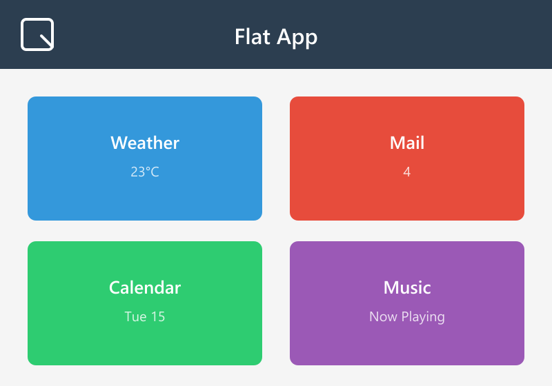
Flat Design
Standard industry vocabulary since ~2012 — the name the skeuomorphism backlash gave itself; NN/g documents both the definition and the history.
Defining Signals
- Solid 2D color fills — every surface is one flat color; no gradients, gloss, texture, or material of any kind
- No simulated depth — no drop shadows, bevels, or highlights; elements sit on one plane, edges drawn by color change alone
- Simple glyph icons — icons are reduced to minimal geometric silhouettes; a single-color shape reads as the whole object
- Color carries the hierarchy — bright, often saturated block colors distinguish actions and regions; color does the job shadows used to do
Overview
What makes this style what it is.
Flat Design renders the interface as pure 2D: surfaces are solid color fills, icons are simple geometric glyphs, and nothing pretends to be lit, embossed, or made of a material. Hierarchy comes from color, size, and typography instead of shadows and bevels. It became the dominant look around 2012–2013 (Windows 8's Metro, then iOS 7) as the direct rejection of skeuomorphism's gloss and texture.
Style brief — paste into your agent
Build the UI using Flat Design. Every surface is a solid 2D color fill — no gradients, no gloss, no texture, no material of any kind. No simulated depth: no drop shadows, no bevels, no highlights. Elements sit on one plane; edges are drawn by color change alone. Icons are reduced to minimal geometric silhouettes — a single-color shape reads as the whole object. Color carries the hierarchy: bright, often saturated block colors distinguish actions and regions.

CSS starting points:
- Card: background: #2196F3; border-radius: 0; box-shadow: none; border: none;
- Button: background: #FF5722; color: #fff; border: none; border-radius: 2px; padding: 12px 24px; font-weight: 600;
- Button hover: background: #E64A19; (color shift, no shadow)
- Background: #FAFAFA; text: #212121;
- Icons: single-color SVG silhouettes, no gradients or shadows
- Type: font-family: 'Roboto', 'Segoe UI', sans-serif; font-weight: 400/500/700;

Do not drift into Skeuomorphism: no gloss, no texture, no material imitation, no lighting effects. Do not drift into Neobrutalism: flat design has no thick borders or hard offset shadows — edges are color-change alone. Do not drift into Minimalism: flat design is about rendering (unshaded 2D), not about reducing content count. Preserve 4.5:1 text contrast on colored fills, provide visible focus rings, and use color + shape (not color alone) to convey interactive states.
Origin
Rose to prominence around 2012: Microsoft's Metro language (Windows Phone 7 in 2010, Windows 8 in 2012) proved it at OS scale, and Apple's iOS 7 redesign in 2013 ended the skeuomorphic era for good. NN/g traces the deeper roots to Swiss/International typographic style.
Often Confused With
This is Flat Design because surfaces are unshaded solid fills and icons are abstract glyphs — nothing imitates a physical object or material. It would become skeuomorphism if the fills grew gloss, texture, and lighting until controls read as physical things you could touch. Vs Minimalism: this is Flat Design because the claim is about rendering — however much content is on screen, it's all drawn as unshaded 2D color.
Related Styles
Explore connected design movements.