Established movement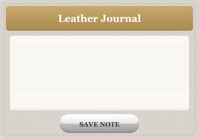
Skeuomorphism
Borrowed from archaeology (a skeuomorph is a derivative object keeping ornamental traces of its original material); standard HCI vocabulary since the 1980s desktop metaphor.
Defining Signals
- Simulated real materials — surfaces look made of something physical (leather, paper, linen, brushed metal) with visible texture or grain
- Physical lighting model — gloss highlights, bevels, and inner shadows imply a light source: buttons bulge outward, fields sink inward
- Real-object metaphors — the UI is drawn as the object it replaces: a notepad with ruled paper, a bookshelf of covers, a dial you rotate
- Crafted physical details — stitching, torn-paper edges, embossed or letterpress text, rivets as ornamental traces of manufacture
Overview
What makes this style what it is.
Skeuomorphism carries real-world materials and objects into digital UI: controls are rendered as if physically made of something — glossy plastic, brushed metal, leather, paper — with the lighting, texture, and affordances of the real thing. A skeuomorphic app teaches itself: a page that looks tearable invites turning, a raised glossy button invites pressing. It peaked in early iOS and Mac OS X, and was largely displaced by flat design around 2013.
Style brief — paste into your agent
Build the UI using skeuomorphism. Every surface should imitate a real, nameable physical material — leather grain, brushed metal, paper fibre, stitched fabric, glossy plastic — with visible texture maps or CSS gradients that read as physical. Light the scene consistently: buttons bulge outward with a top-left specular highlight and a bottom bevel; inputs sink inward with an inset shadow as if carved into the surface. Use real-object metaphors: a notepad with ruled paper and a torn edge, a bookshelf of covers, a rotary dial. Add crafted physical details — stitching along card edges, embossed or letterpress text, rivets, and torn-paper dividers.

CSS starting points:
- Leather card: background: linear-gradient(145deg, #5c3a1e, #3e2512); background-image: url(leather-seamless.png); box-shadow: inset 0 1px 0 rgba(255,255,255,.15), 0 4px 12px rgba(0,0,0,.5);
- Glossy button: background: linear-gradient(180deg, #f7f7f7 0%, #d4d4d4 50%, #bbb 51%, #ccc 100%); box-shadow: inset 0 1px 0 rgba(255,255,255,.8), 0 2px 6px rgba(0,0,0,.4); border: 1px solid #999;
- Pressed/inset field: box-shadow: inset 0 2px 6px rgba(0,0,0,.35), inset 0 1px 2px rgba(0,0,0,.2); background: #fff;

Do not drift into flat design: every surface must have texture, lighting, and a physical metaphor. Do not drift into neumorphism: skeuomorphic objects imitate specific real materials, not an abstract matte extrusion. Preserve 4.5:1 text contrast on textured fills, provide visible focus rings, and ensure pressed states are distinguishable beyond shadow depth alone.
Origin
As old as the GUI itself (the 1980s desktop metaphor), but the style label usually points at Apple's 2007–2012 era — iOS's leather calendars, felt Game Center, and reel-to-reel Podcasts app under Scott Forstall — ended publicly by iOS 7's flat redesign in 2013.
Often Confused With
This is skeuomorphism because surfaces imitate real, nameable materials — leather, paper, metal — with rich lighting, texture, and object metaphors. It would become neumorphism if every material and texture vanished and all controls were instead extruded from one continuous matte surface with soft dual shadows. Vs Frutiger Aero: this is skeuomorphism when the point is imitating a specific physical object or material in the interface itself. It would become Frutiger Aero if the gloss stayed but the materials turned into a glassy blue-green tech-nature mood — sky, water, grass — rather than any one imitated object.
Related Styles
Explore connected design movements.