Industry-coined trend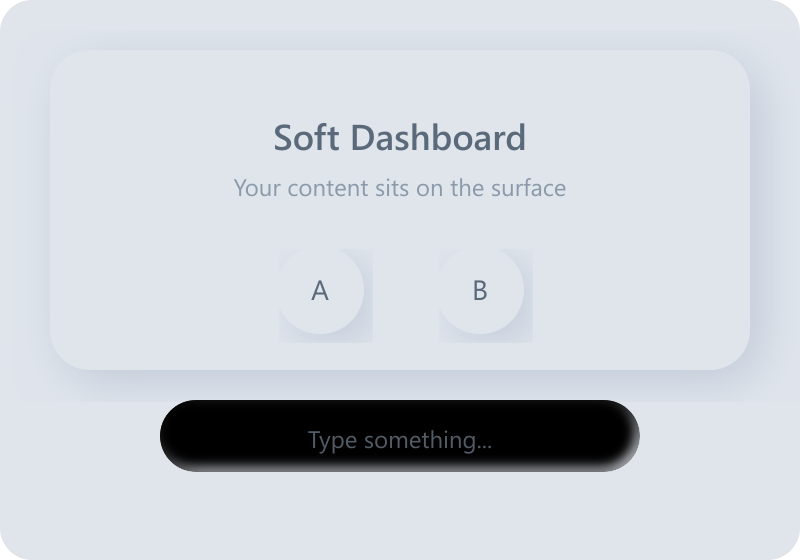
Neumorphism
Coined in late 2019 (a portmanteau of 'new skeuomorphism'), popularized by Michal Malewicz's articles and Alexander Plyuto's Dribbble shots. A trend label, not an academic term.
Defining Signals
- One continuous surface — controls and background share the same matte color; elements aren't placed on the page, they're molded from it
- Dual soft shadows — every raised element carries two blurred shadows: a light one up-left and a dark one down-right
- Pressed (inset) states — inputs and active states invert the shadow pair inward so the element looks pressed into the surface
- No borders, whisper contrast — edges exist only where the shadows fade; no outlines, no strong fills
Overview
What makes this style what it is.
Neumorphism renders every control as if extruded from, or pressed into, the page itself: background and controls share one matte color, and shape comes entirely from a pair of soft shadows — light from the top-left, dark toward the bottom-right. Nothing has a border and nothing floats; the whole interface reads as one continuous molded surface. It photographs beautifully and tests poorly: the same softness that makes it distinctive erases the contrast real controls need.
Style brief — paste into your agent
Build the UI using neumorphism. The entire interface is one continuous matte surface — controls and background share the exact same color. Elements are not placed on the page; they are molded from it. Every raised control carries two soft blurred shadows: a light one up-left and a dark one down-right. Inputs and active states invert the shadow pair inward so the element looks pressed into the surface. No borders, no outlines, whisper-contrast edges that exist only where the shadows fade.

CSS starting points:
- Background + raised element (same color): --bg: #e0e5ec; background: var(--bg);
- Raised: box-shadow: 8px 8px 16px #b8bec5, -8px -8px 16px #ffffff;
- Pressed/inset: box-shadow: inset 8px 8px 16px #b8bec5, inset -8px -8px 16px #ffffff;
- Controls: border-radius: 16px; border: none; outline: none;

Do not drift into skeuomorphism: no textures, no material imitation, no object metaphors. Do not drift into claymorphism: neumorphic elements share the background's exact color and have no independent fill or drop shadow — only dual light/dark shadows implying shape from one continuous surface. Preserve 4.5:1 text contrast (this is the style's hardest constraint), pair pressed/selected states with a content or color change, not shadow depth alone, and provide visible focus rings.
Origin
A Dribbble-era trend: Alexander Plyuto's 2019 'Skeuomorph Mobile Banking' shots went viral, Jason Kelley's comment coined the name, and Michal Malewicz's 2019–2020 articles defined and then warned about it. It stayed mostly a concept-shot style — few shipping products survived its accessibility costs.
Often Confused With
This is neumorphism because the controls and the background are one material-less matte surface, shaped only by soft dual shadows. It would become skeuomorphism if surfaces started imitating real nameable materials — leather grain, glossy plastic, brushed metal — with textures and object metaphors. Vs Glassmorphism: this is neumorphism because every element is opaque and shares the background's exact color — depth comes from shadows, not transparency.
Related Styles
Explore connected design movements.