Industry-coined trend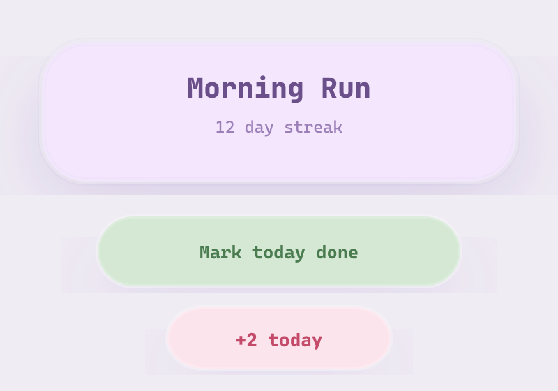
Claymorphism
Coined by Michal Malewicz (HYPE4 Academy) in 2021, continuing the '-morphism' naming train; Smashing Magazine gave it an independent technical treatment in 2022.
Defining Signals
- Two inner shadows + one outer — a light inner shadow on top, a darker inner shadow at bottom, and a soft drop shadow below; the surface reads as inflated
- Oversized corner radii — corners are dramatically round (radii around a third of the element's height); every shape reads as a soft blob
- Independently colored, floating objects — each element has its own fill distinct from the background and visibly floats above it
Overview
What makes this style what it is.
Claymorphism makes UI elements look molded from soft modeling clay: fat rounded corners, a light pastel fill, and the signature construction — two inner shadows (a bright one catching the top edge, a darker one shading the bottom) plus one soft outer drop shadow that floats the object above the page. Each element is independently colored and clearly separate from the background, usually paired with chunky 3D 'clay' illustrations.
Style brief — paste into your agent
Build the UI using Claymorphism. Every element looks molded from soft modeling clay: fat rounded corners, a light pastel fill, and the signature construction — two inner shadows (a bright one catching the top edge, a darker one shading the bottom) plus one soft outer drop shadow that floats the object above the page. Each element is independently colored and clearly separate from the background. Corners are dramatically round — radii around a third of the element's height.

CSS starting points:
- Clay card: background: #f4e7fd; border-radius: 26px; box-shadow: 0 20px 36px rgba(120,90,180,.22), inset 0 -8px 14px rgba(120,90,180,.18), inset 0 6px 12px rgba(255,255,255,.65);
- Clay button: background: #e7f9e7; border-radius: 20px; box-shadow: 0 12px 24px rgba(80,160,80,.2), inset 0 -6px 10px rgba(80,160,80,.15), inset 0 4px 8px rgba(255,255,255,.6);
- Pressed state: box-shadow: 0 8px 16px rgba(120,90,180,.2), inset 0 -4px 8px rgba(120,90,180,.22), inset 0 10px 14px rgba(120,90,180,.12);
- Background: soft tinted pastel, e.g. #faf5ff or #f0faf0

Do not drift into Neumorphism: clay objects have their own color and a visible drop shadow — never the background's color with shadows alone implying shape. Do not drift into Skeuomorphism: the material is an invented toy substance, no real-world object or texture is being imitated. Preserve 4.5:1 text contrast on pastel fills, pressed/hover states that deepen the inner shadows rather than removing them, and visible focus rings.
Origin
Named in 2021 by Michal Malewicz as the friendlier successor to neumorphism, riding the wave of soft-3D illustration in fintech and edtech marketing; the recipe (two inner shadows + one outer, oversized radii) comes from his original article.
Often Confused With
This is claymorphism because each puffy element is independently colored and floats above the background on a real drop shadow. It would become neumorphism if every element took the background's exact color and sat flush in the surface, with only dual light/dark shadows implying shape — molded from one continuous material instead of placed on it. Vs Skeuomorphism: this is claymorphism because the material is an invented toy substance — no real-world object or texture is being imitated.
Related Styles
Explore connected design movements.