Industry-coined trend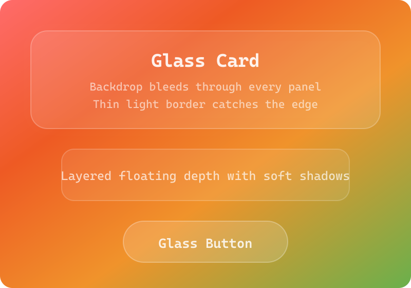
Glassmorphism
Coined by Michal Malewicz in 2020 as a trend label for a much older frosted-glass effect (Windows Vista Aero, iOS 7 blur, macOS vibrancy).
Defining Signals
- Frosted translucent panels — surfaces are semi-transparent with a strong background blur, like frosted glass
- Vivid backdrop showing through — a colorful gradient, photo, or aurora sits behind the glass; its color bleeds through every panel
- Thin light edge — a 1px semi-transparent white border catches the rim of each panel, separating glass from glass
- Layered floating depth — panels float above the backdrop and above each other with soft, wide shadows
Overview
What makes this style what it is.
Glassmorphism builds interfaces from translucent, frosted panels: the background — usually something vivid — blurs through each surface, a thin light border catches the 'edge' of the glass, and layers stack with soft shadows to sell the depth. The style lives or dies by its backdrop: over a plain background the glass reads as plain grey; over a colorful gradient it glows.
Style brief — paste into your agent
Build the UI using glassmorphism. Every panel and card is a translucent, frosted-glass surface: semi-transparent fill with a strong background blur, like looking through frosted glass. Place a vivid, colorful backdrop behind everything — a gradient, aurora, or photo — so its color bleeds through every panel. Each glass panel has a thin 1px semi-transparent white border catching the rim, and panels float above the backdrop and above each other with soft, wide shadows.

CSS starting points:
- Glass panel: background: rgba(255, 255, 255, 0.12); backdrop-filter: blur(20px) saturate(180%); -webkit-backdrop-filter: blur(20px) saturate(180%); border: 1px solid rgba(255, 255, 255, 0.18); border-radius: 16px; box-shadow: 0 8px 32px rgba(0, 0, 0, 0.15);
- Backdrop: a vivid gradient or image covering the full viewport behind all glass layers
- Text on glass: color: rgba(255, 255, 255, 0.9); — keep contrast high against the blurred backdrop

Do not drift into neumorphism: glass panels are translucent and depend on a colorful backdrop blurring through — neumorphism is fully opaque with shadows alone. Do not drift into Liquid Glass: this glass is a decorative skin applied to content cards and dashboards, not a functional system material reserved for controls. Preserve 4.5:1 text contrast over the blurred backdrop, provide visible focus rings, and ensure the backdrop is vivid enough that the frosted effect is actually visible.
Origin
The effect is decades old — Windows Vista's Aero glass (2006), iOS 7's blur layers (2013), macOS vibrancy — but the style label dates to Michal Malewicz's 2020 article, after the look spread through Dribbble and Big Sur-era redesigns.
Often Confused With
This is glassmorphism because the frosted treatment is a generic decorative skin — content cards, dashboards, whole panels can all be glass over a wallpaper you chose. It would become Liquid Glass if the glass were reserved for the control layer — bars, buttons, navigation floating above app content — using Apple's adaptive material that lenses and re-tints from whatever scrolls beneath it. Vs Neumorphism: this is glassmorphism because panels are translucent and depend on a colorful backdrop blurring through.
Related Styles
Explore connected design movements.