Industry-coined trend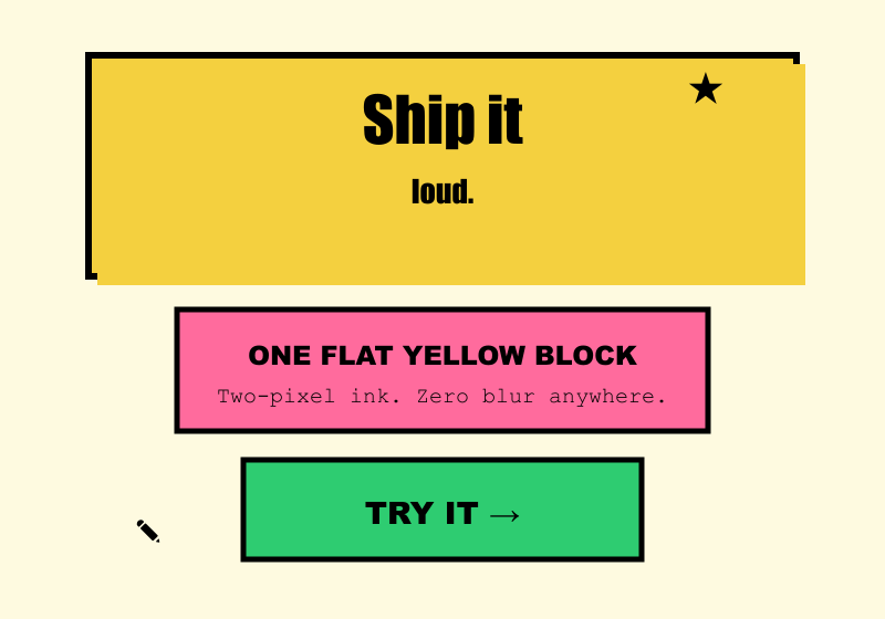
Neobrutalism
Industry-coined early-2020s label (also spelled neo-brutalism/neubrutalism); contested because it borrows brutalism's name for a look that is heavily styled rather than raw.
Defining Signals
- Thick black outlines — every element wears a uniform 2-3px solid black border, like an inked comic panel
- Hard offset shadows — shadows are solid black shapes displaced down-right with zero blur; graphic depth, not simulated lighting
- Saturated flat color blocks — unapologetic fills in yellow, hot pink, lime, cyan laid flat on a cream or white ground
- Chunky display type — bold, blocky grotesks or display faces, often oversized; body text stays plain so headings can shout
Overview
What makes this style what it is.
Neobrutalism is a designed graphic language: flat, saturated color blocks outlined in thick black strokes, with hard offset shadows — solid black rectangles displaced a few pixels, no blur — and chunky display type. Elements read like stickers or risograph prints; pressing a button often physically 'pushes' it into its shadow. Despite the name it is the opposite of raw: every border and shadow is a deliberate illustration choice.
Style brief — paste into your agent
Build the UI using Neobrutalism. Every element wears a uniform 2-3px solid black border, like an inked comic panel. Shadows are solid black shapes displaced down-right with zero blur — graphic depth, not simulated lighting. Use saturated flat color blocks: yellow, hot pink, lime, cyan laid flat on a cream or white ground. Chunky display type — bold, blocky grotesks or display faces, often oversized; body text stays plain so headings can shout. Pressing a button physically 'pushes' it into its shadow.

CSS starting points:
- Card: border: 3px solid #000; border-radius: 8px; background: #FFE66D; box-shadow: 6px 6px 0 #000;
- Button: border: 3px solid #000; border-radius: 8px; background: #FF6B9D; box-shadow: 4px 4px 0 #000; transition: all 0.1s;
- Button pressed: transform: translate(4px, 4px); box-shadow: 0 0 0 #000;
- Headings: font-family: 'Archivo Black', 'Inter', sans-serif; font-weight: 900; font-size: 3rem;
- Background: #FFF8E7 or #FFFFFF

Do not drift into Web Brutalism: this is a heavily designed graphic language with thick borders, hard shadows, and saturated colors — not raw browser defaults. Do not drift into Neumorphism: edges are maximum-contrast black ink and shadows are hard graphic shapes, not soft dual shadows. Preserve 4.5:1 text contrast on saturated fills, ensure pressed states are visually distinct (translate into shadow), and provide visible focus rings.
Origin
Emerged around 2020–2022 in product marketing and portfolio sites (Gumroad's 2021 redesign is the era's poster child), catalogued by NN/g in 2023 as a reaction to soft, same-looking SaaS design — flat design turned up to eleven with comic-book construction.
Often Confused With
This is Neobrutalism because the rawness is a designed costume: uniform thick borders, hard offset shadows, and saturated blocks are deliberate graphic choices. It would become Web Brutalism if the styling were removed rather than exaggerated — browser-default type, plain blue links, bare structure, and no decorative rendering at all. Vs Neumorphism: this is Neobrutalism because edges are maximum-contrast black ink and shadows are hard graphic shapes.
Related Styles
Explore connected design movements.