Retrospective label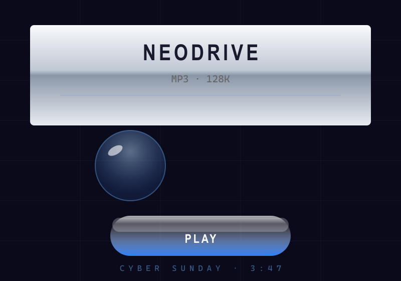
Y2K Digital Aesthetic
A retrospective label: the era (~1997–2004) didn't call itself Y2K — the name was applied by 2010s–2020s revivalists and aesthetic cataloguers.
Defining Signals
- Liquid chrome and metal — mirror-finish chrome, brushed steel, and silver gradients; type and frames rendered as if machined and polished
- Gel and glossy plastic — translucent candy-like buttons with strong specular highlights; the 'you want to lick it' gloss
- Iridescent blue-silver palette — electric blue, silver, white, and holographic cyan-magenta shifts; cool synthetic color
- Wide techno type — extended, rounded or squared techno faces (Eurostile-flavored), often italicized, outlined, or chromed
Overview
What makes this style what it is.
The Y2K digital aesthetic is millennium-turn techno-optimism rendered literally: liquid chrome and brushed metal, glossy gel and plastic surfaces, iridescent blue-silver palettes, orbs and blobs, wide techno type, and rendered 3D everything. It's the look of a future imagined through new consumer tech — translucent iMacs, early CGI, rave flyers, and 'cyber' branding — shiny, synthetic, and unembarrassed.
Style brief — paste into your agent
Build the UI using the Y2K Digital Aesthetic. Surfaces are liquid chrome and brushed metal — mirror-finish gradients, silver and steel. Buttons and controls are glossy gel and translucent candy-like plastic with strong specular highlights — the 'you want to lick it' gloss. Palette is iridescent blue-silver: electric blue, silver, white, holographic cyan-magenta shifts, cool synthetic color. Type is wide and techno: extended, rounded or squared techno faces (Eurostile-flavored), often italicized, outlined, or chromed. Add orbs, blobs, and rendered 3D elements.

CSS starting points:
- Chrome surface: background: linear-gradient(135deg, #c0c0c0 0%, #ffffff 25%, #a0a0a0 50%, #e0e0e0 75%, #808080 100%);
- Gel button: background: radial-gradient(ellipse at 30% 20%, rgba(255,255,255,0.9) 0%, #4a9eff 40%, #1a5fff 100%); border-radius: 50%; box-shadow: inset 0 -4px 8px rgba(0,0,0,0.3), 0 4px 12px rgba(0,0,0,0.4);
- Iridescent shift: background: linear-gradient(135deg, #00d4ff 0%, #ff00ff 50%, #00d4ff 100%);
- Type: font-family: 'Eurostile', 'Bank Gothic', sans-serif; font-style: italic; letter-spacing: 0.1em; text-transform: uppercase;

Do not drift into Frutiger Aero: Y2K is synthetic and machine-focused — chrome, gel plastic, iridescent blue-silver. Frutiger Aero adds nature — skies, water, grass, bubbles. Do not drift into Skeuomorphism: Y2K is a futurist mood applied to graphics at large, not imitating specific physical objects. Preserve 4.5:1 text contrast on chrome and iridescent backgrounds, provide visible focus rings, and ensure interactive states are distinguishable.
Origin
Roughly 1997–2004: Apple's translucent iMac G3 and Aqua, PlayStation-era CGI, Designers Republic-style rave graphics, and dot-com 'cyber' branding. Rediscovered and named by 2010s–2020s internet archaeology and the fashion/graphics revival that followed.
Often Confused With
This is Y2K because the optimism is synthetic — chrome, gel plastic, iridescent blue-silver, techno type; the future is machines and cyberspace. It would become Frutiger Aero if the gloss stayed but nature flooded in — blue skies, water, grass, and bubbles fused with clean humanist type into eco-tech Web 2.0 optimism. Vs Skeuomorphism: this is Y2K when gloss and chrome are a futurist mood applied to graphics at large.
Related Styles
Explore connected design movements.